ungfritid.no
Redesign of a digital platform for youth activities. Improve user experience and accessibility.
UX Design
2 UX designers
2 Graphic designers
12 weeks
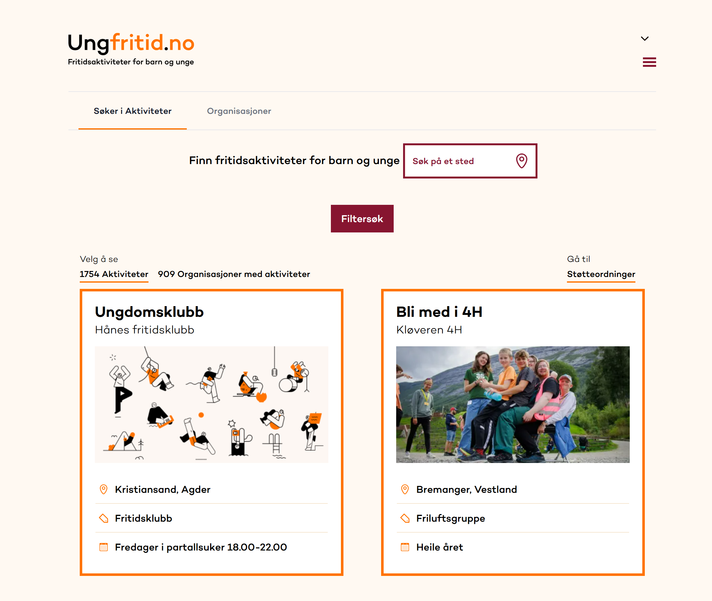
Existing design
Call out a feature, benefit, or value of your site that can stand on its own.
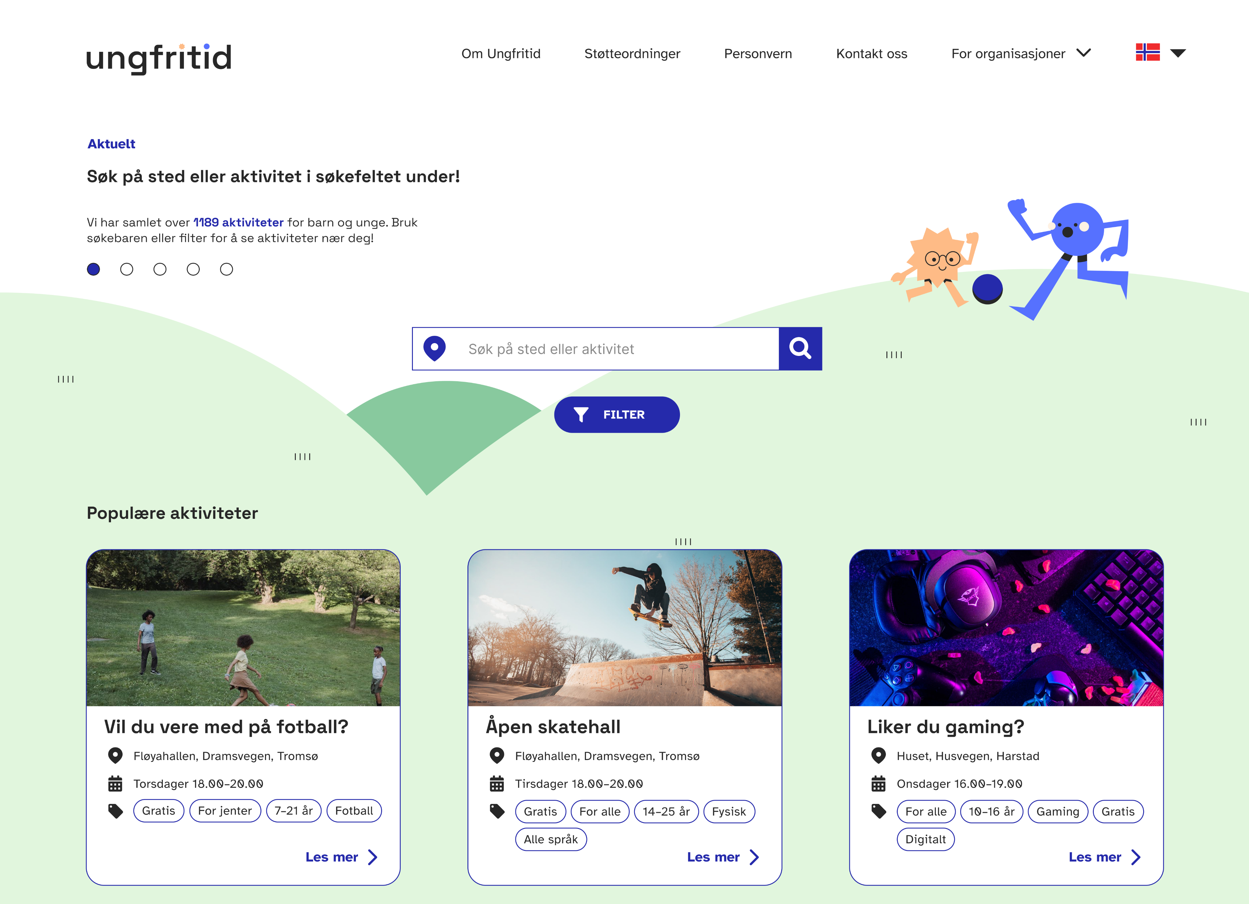
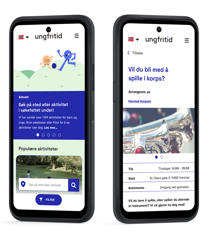
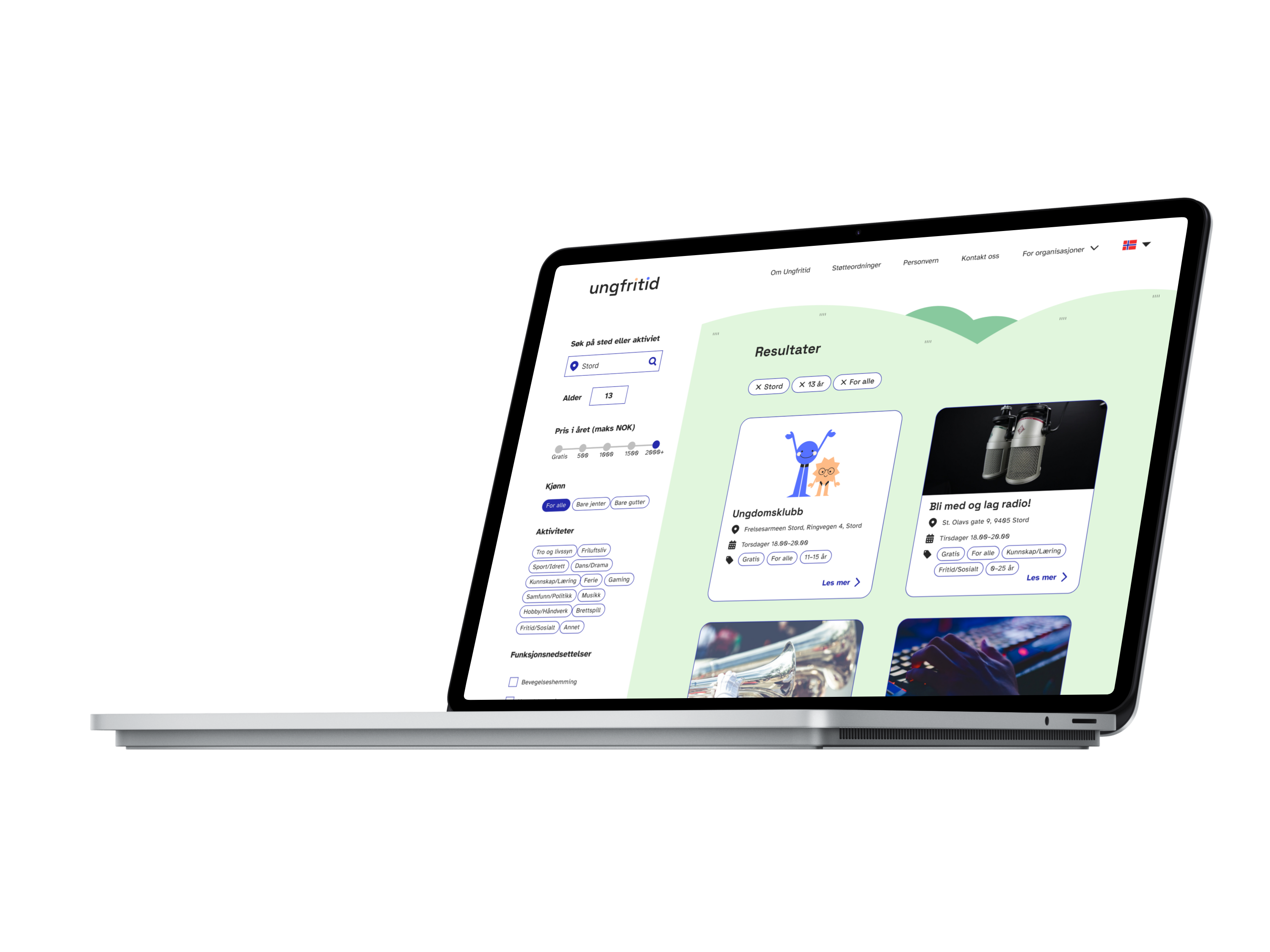
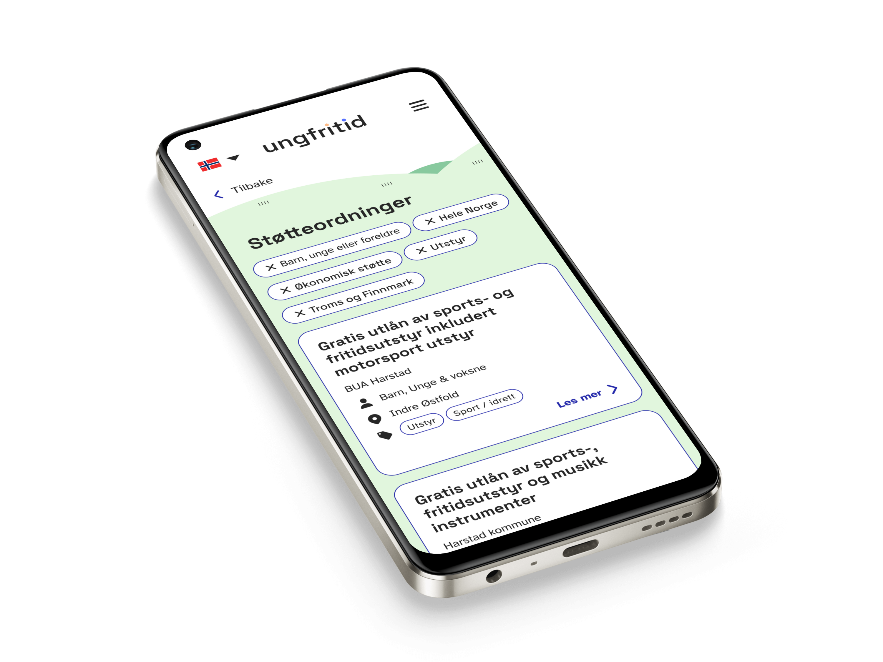
Redesigned site
Call out a feature, benefit, or value of your site that can stand on its own.
Keep the Activity Overview Accessible
Users were overwhelmed by the activity feed loading all activities in the country on page load.
Insights (Survey + Interviews)
- Users immediately started scrolling through the entire activity list
- Most never noticed the filter button placed in the middle of the screen
- The filter felt messy and hard to use
- Users wanted price and “free activity” information visible upfront
Solution
- Redefined the landing experience to show a limited, location-based selection
- Moved and redesigned filters to be visually clear and easy to discover
- Simplified filtering into fewer, more intuitive categories
- Added clear price tags and free-activity indicators directly on activity cards
Fix the Navigation and Information Structure
The existing site had too many hierarchical levels and buried pages.
Insight
- Confusing navigation with unnecessary sub-pages
- Important information hidden multiple clicks deep
- Users struggled to understand how the site was structured
Solution
- Rebuilt the information architecture to reduce depth and redundant pages
- Consolidated related content into clearer sections
- Designed a simple, predictable navigation structure focused on “Find Activity”
- Ensured all essential information is accessible within one or two interactions
Make the Design Engaging and Accessible
Challenge
- The visual design felt uninspiring and had accessibility issues.
Insights (Survey + Interviews)
- Users immediately started scrolling through the entire activity list
- Most never noticed the filter button placed in the middle of the screen
- The filter felt messy and hard to use
- Users wanted price and “free activity” information visible upfront
Solution
- Introduced a more vibrant, youth-friendly visual language
- Increased contrast and improved typography for readability
- Updated card layouts, spacing, and iconography for a cleaner, more inviting look
- Optimized color use for WCAG accessibility without losing personality